

Vol. IX, No. 7, August 2009
- Editor's corner
- Social media pays
- The future of leisure time; a new value equation
- The iconic hamburger/cheeseburger goes premium
- Business death spiral!
- Foundations Entertainment University, Oct. 6-8, Dallas, Texas
- BellaBoo's opens Sept. 15
- Vicki Stoecklin featured in two magazines
- Put your business correctly on the map
- 100 flavors in new Coca-Cola soda machine
- How Americans spent their time in 2008
- Chuck E. Cheese's reports 2nd quarter results
- New clients
How Americans spent their time in 2008
The online version of the July 31, 2009, Sunday New York Times has an incredible interactive graphic of how Americans spent their time in 2008. You can see different graphs based on demographic characteristics, including employed and unemployed. The interactive feature allows you to see specific time use for every 10 minutes of the day. One interesting observation we noticed is how time spent watching television and movies decreases with increasing levels of education.
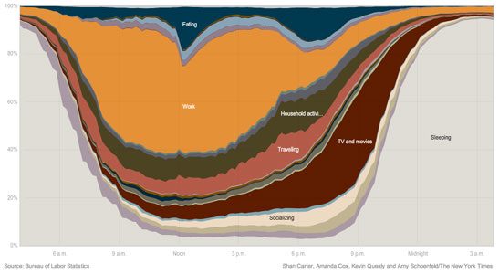
One of many interactive graphs from the Sunday New York Times
Vol. IX, No. 7, August 2009
- Editor's corner
- Social media pays
- The future of leisure time; a new value equation
- The iconic hamburger/cheeseburger goes premium
- Business death spiral!
- Foundations Entertainment University, Oct. 6-8, Dallas, Texas
- BellaBoo's opens Sept. 15
- Vicki Stoecklin featured in two magazines
- Put your business correctly on the map
- 100 flavors in new Coca-Cola soda machine
- How Americans spent their time in 2008
- Chuck E. Cheese's reports 2nd quarter results
- New clients